Horizon Residence
Ivory bouclé
Travertine
Walnut
Brushed brass
An open horizon. Sculpted forms. A softer way to live.
Explore this palette
A considered palette is more than a set of colours. It is the way surfaces, light and touch come together.
Build a palette around a few materials with a clear relationship. A quiet foundation. A tactile layer. One deliberate contrast. Use our concept palettes as a starting point.
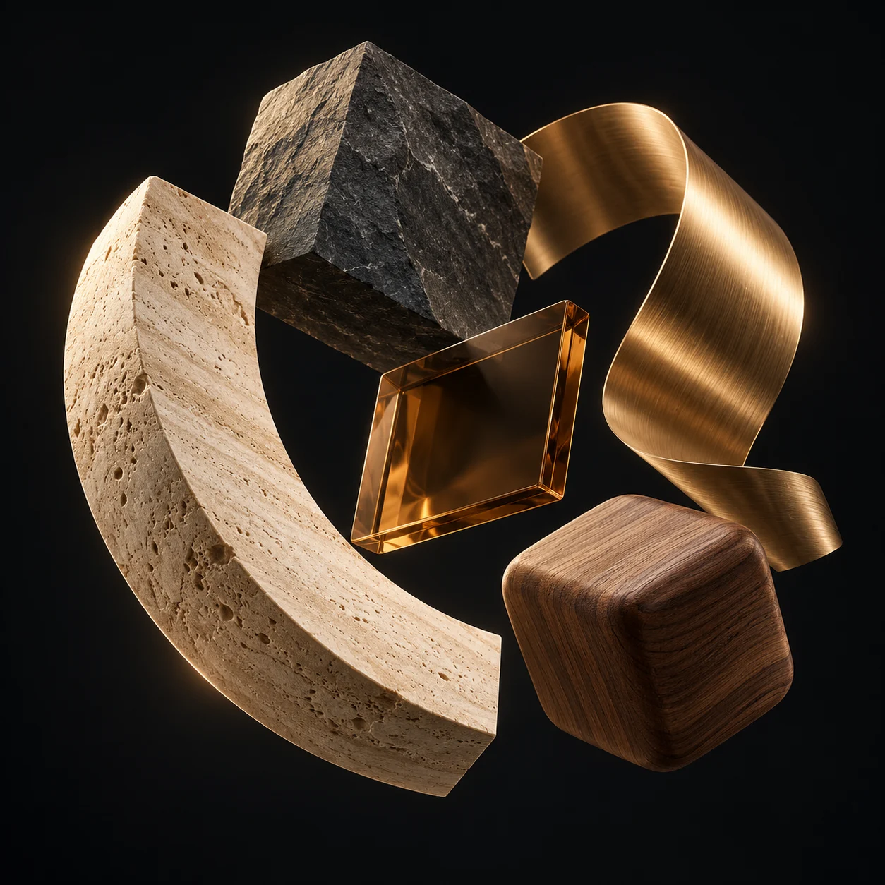
An open horizon. Sculpted forms. A softer way to live.
Explore this paletteA workspace that makes room for your best thinking.
Explore this paletteGrounded in texture. Connected to the world outside.
Explore this palette
A clearer direction. A more considered space.
Your next idea, brought into focus.